A Field Guide to Sprites
The life and behaviorisms of the little people
A tutorial which should not be necessary by JustKim
i. Background
- For every person who enjoys jumping right in and developing skills through trial and error, there are ten who refuse to take a step without consulting a comprehensive guide. This is true in science, Final Fantasy games, and unfortunately the world of spriting as well.
- Those of you who haven't already, take a look at Gauntlet's tutorial, which goes much further into getting started on your sprite. If you have already and you're still having problems, I can only assume it's because you don't understand shading with high contrast. Here then is something I threw together while battling the flu.
ii. Gestation
- Assuming you're going to be making a sprite that's at least partially custom, it might be a good idea to have another sprite handy to compare proportions, and to swipe shades of color. It's not against the rules to use someone else's sprite for this, as long as you don't include their sprite or any portion of their sprite in your finished product.
-
(!) Fantastic Fact (!) -
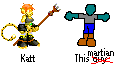
Most spriters get real pissy when you use their stuff as a base!  Here I'm going to use my Katt sprite as an example to work with. (see fig. A)
- Katt's the right height for a sprite (hey, that rhymes), her proportions are decent and she has a fair number of shades. The first step is to copy down Katt onto a new file in MS Paint, leaving enough space for the new sprite to be sketched up.
 This guy (see fig. B) is about the same size as Katt, even if drawn rather poorly. This is a damn tutorial, I have the flu and I haven't sprited in over a year so shut your trap. Anyway, now you have the basic shell of a sprite, next comes the design.
iii. Adolescence
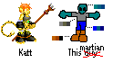
 As you can see in fig. C, I gave my guy some personality and turned him into a martian. He lacks any sort of textures or alignment, but keep in mind this is a damn tutorial, I have the flu, and I haven't sprited in over a year. The black you used in the last step should now be completely enclosed, not only around the sprite itself but as a buffer for the different colors you intend to use. Don't worry about making it perfect pixel by pixel, you'll probably be erasing this later anyway.
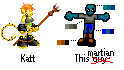
 In fig. D I began mixing palettes, starting with the base color and increasing the darkness with the color editor in MS Paint. My palettes were pretty constrained because I was making guesswork of which colors would be picked up on the convertion to GIF, and that'll cost me later in the pants area. You should have better luck if you use a better art program to change it to GIF, or if you make it a JPG instead, but I'm skipping way ahead here. Just remember to use 2-4 shades of color. You should never need any more than that.
iv. Maturity
 Starting in fig. E, this martian took shape. When shading sprites, ALWAYS shade from the inside out, so that small spaces are clearly defined. Larger areas can have ligher shades more toward an edge to give the illusion of light source, but these are best left vague and should NEVER touch the edge or run over it. The basic concepts of lighting and textures do not apply to sprites. Your only concern should be to make the image discernable in spite of its small size. Anything else will turn out like crap.
v. Summary
 Some of you may still be struggling with these concepts, so I'll elaborate. Fig. F is a sphere with only 3 shades of color, obviously. These shades are clear when they're large, but in the palette below the sphere it's harder to make out. Those are the same colors, but there doesn't appear to be any change in shade at all. The contrast in sprite shading has to be higher to be clearly visible, and overlapping shapes like the martian's thumbs in fig. E should be done at the darkest shade with no progressive shading before or after. Otherwise the shape won't stand out. Even if you have a thumb overlapping a row of fingers, you won't shade that row of fingers because it only blurs the thumb's definition. Got it?
 Fig. G shows you examples of giving the illusion of light source. Notice in the rectangle the darkest shade doesn't wrap completely around and only serves as a buffer in the lower right-hand corner. The darker an area on a sprite, the less contrast it should have as a result of more shades packed together. This makes the area harder to see and gives the illusion of darkness.
 Finally fig. H, which shows yet another example of shading. Honestly, I'm sick of this but I'm going to keep on. The lightest shade never touches the edge, as it should never, and again the shapes are shaded from the inside out. I seriously don't know what else to tell you. If you're still having problems by now your trouble area is probably the drawing itself, in which case it isn't a spriting tutorial you need at all and you're wasting everyone's time asking for one. The only advice I can give you if that's the case is to stick with fig. B until such time you make something bearing some resemblance to your example.
- (!) Fantastic Fact (!)
- THIS TUTORIAL IS *OVER*!